Posts

Haiku Project

Image
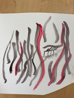
      the sky I see seems full of magnolia blossoms            -Natsume Soseki      For my process I put this project together in reverse order, with the digital editing part happening first and the creating on paper happening second. For the digital part, I started with an image that I wanted to be my background and chose more images with a similar color scheme and subject to layer on top of it and adjusted the transparencies so they would meld together into one image. For the final images, I was inspired by previous exercises that we have done in class. I liked the idea that we practiced of using marker to draw over a printed image, which to me feels like a more interactive way to edit. I used markers with colors that are in the pictures to draw over some lines in the images along with adding designs outside of the frame of the picture. This was another reason why I wanted to do this part non-digitally: I wanted to expand the idea into a space larger tha

Project 4 Part 3: Shorthand Tone

Image
       This project has been my favorite so far. Portraits are something I have done before and have always thought it was really interesting to create a recognizable face from a blank piece of paper. Although, this was also a new experience because I have never used this method before of creating many small marks to make up a shape rather than using more fluid lines. I think I even ended up liking this approach better because it gave the final sketches a more raw feel.                Usually I struggle with the editing process and end up liking the original unedited version better than what my experience with the digital side of things can produce. This time was different though. The final outcome still wasn't what I had exactly in my head as I was adding the digital lines but it rarely is. I've come to accept this as part of the process, and sometimes the unexpected outcome can be better than what I was planning. I like that the sec

Project 4 Part 2: An Emotional Response

Image
    The assignment was to translate the emotions of creepy and sinister, soft and pliable, spiky and brittle, and dramatic and flamboyant, which are represented here respectively. I had never worked with watercolors prior to this other than as an activity to keep me busy as a kid, so a lot of this process was experimenting with the different textures and shapes I could create by holding the brush differently or using more or less water. I didn't realize how versatile watercolors allow you to be because you can create endless different saturations of paint. I took the freedom that this medium allowed me to feel and tried to translate that into the four very different emotions. I wanted to try to use different colors in each one because of how closely related colors and emotions tend to feel. I usually try to focus in on a visual source of inspiration, so painting abstract designs was also something I wan't familiar with but that again I felt like the medium lent it

Project 4 part 1: Manic Marks

Image
      These drawings to me are a primary color series: the first is yellow, the second blue, and the third red.       The yellow drawing was interesting because I played with different textured marks such as dots, small triangles for the hair, and scribbled in marks for the colored in parts. I like how the dots come together to create a bigger picture, and the tiles of the floor come together to fill a bigger space as well. I kept the editing simple, adding another texture to the picture with a splatter like effect of the yellow.      The blue drawing has the most negative space of the three. The shapes don't fully connect but you can tell what they make up while still letting the viewer fill in the gaps. The marker swipes give it more of an abstract feel. Overall the original drawing feels like the most calming of the three because of the cool tones, so I thought I would make it the most bright and almost obnoxious in color in the edit. I also traced back over some of

Obsessive Drawing

Image
       This obsessive drawing began as an exercise in class, drawing dots on top of certain words and connecting them in any way we wanted. I like the way the original drawing looks like a crystal; even though it is a flat object it takes on a three dimensional prismatic quality, like you'd expect it to reflect light in all directions. My favorite thing about it is that "glass" is a word printed on the page, which mirrors the glass-like effect of the drawing. The edited version looks to me like melting glass, like it sat in hot enough light that it started dripping. I like how I got to melt and stretch the words on the page also and make them a part of the piece as a whole. There was something comforting that came from not starting off with a blank page, and I enjoyed how the words could inform the drawing.

Wendy Red Star Inspired In Class Exercise

Image

Obituary

Image
       The given obituary reminded me of the feeling of a desert outlaw, and so in my head I kept seeing images of a cactus in the desert. Especially because the one main cactus throughout all three pictures has a shape similar to that of a person: it felt representative of the man to me. Deserts are known for being unforgiving and a place one would go to be alone, which seemed like it mirrored the man's life to its end. In the first image I made the smaller picture on the inside brighter to show the beginning of his journey, perhaps full of intent as he tries to reach something new in life. The second picture I thought started to look like a blurry hallucination or mirage, something that is also associated with deserts, to show the transition into where things went wrong. The final picture is black and white and distorted to represent the ending that the man faced.